Color
Palettes, contrast, and grade choices that carry emotion and period.
24 techniques
Bleach Bypass
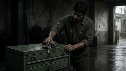
Bleach BypassA digital silver-retention-inspired look combines reduced chroma with dense shadows and forceful tonal contrast; it is not simple monochrome.
Color Grade

Color GradePost-production adjustments of tonal response, hue and saturation establish a consistent intended appearance.
Color Shift

Color ShiftAn intentional visible transition changes the image's color state over time while action remains continuous.
Complementary Color

Complementary ColorOpposing hue families on a stated color wheel are placed in distinct visual masses to increase chromatic contrast.
Cool Blue
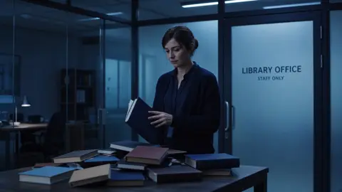
Cool BlueA stable grade biases the image toward blue or cyan rather than relying on a change of weather or time.
Cool Palette

Cool PaletteA restricted cool hue family is built into set and costume design, with grading supporting rather than replacing those choices.
Cross Process
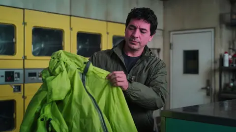
Cross ProcessA digital imitation of mismatched film processing deliberately skews channel relationships, creating unusual hue and contrast interactions.
Day for Night

Day for NightDaylight footage is staged and graded to read as night by controlling daytime cues and tonal hierarchy.
Desaturation

DesaturationReducing colorfulness leaves residual hue while luminance structure can remain otherwise unchanged.
Filmic Faded

Filmic FadedA print-inspired tone curve lifts the darkest values and gently compresses highlights without erasing image structure.
Hyper-Saturation

Hyper-SaturationA deliberately heightened chroma treatment makes selected material colors unusually intense while retaining tonal readability.
Monochrome

MonochromeA neutral black-and-white image removes chromatic distinctions so subjects separate through luminance and texture.
Moonlight Gel
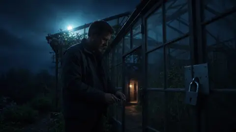
Moonlight GelA directional cool source stands in for moonlight on set, with limited fill preserving a nighttime reading.
Natural Grade

Natural GradeColor correction preserves plausible material hues and source relationships instead of imposing a stylized global bias.
Overexposed
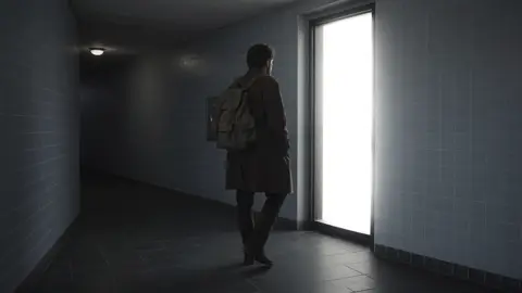
OverexposedIntentional exposure or grading pushes selected bright regions past recoverable detail while preserving chosen visual anchors.
Palette
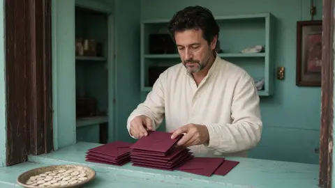
PaletteA limited repeatable set of hues coordinates materials, costume and image treatment across a scene.
Saturated Look
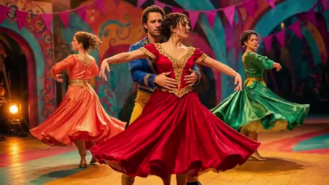
Saturated LookA controlled increase in colorfulness strengthens selected material hues without the extreme intensity of hyper-saturation.
Sepia
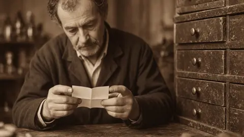
SepiaA largely monochromatic brown-toned rendering maps luminance into a narrow warm hue family.
Split Toning

Split ToningDifferent tonal ranges receive distinct hue biases, with a controlled transition through the midtones.
Teal and Orange
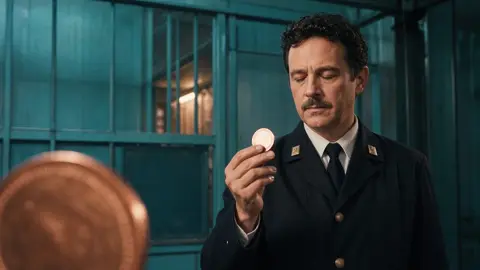
Teal and OrangeA complementary grade separates warm skin and selected highlights from cooler teal surroundings.
Tungsten Balance

Tungsten BalanceA camera white balance near 3200 K renders tungsten-like illumination near neutral while daylight sources appear comparatively blue.
Vintage

VintageAn original aged-color treatment combines restrained dye-like fading and photochemical-style texture without claiming a specific stock history.
Warm Amber

Warm AmberA stable overall warm grade favors amber hues while retaining a full-color scene rather than a sepia scale.
Warm Palette

Warm PaletteRelated warm material colors organize a scene while neutral lighting preserves differences among them.